Microsoft Has a New Logo after 25 Years
For the first time in 25 years Microsoft have their selves a new logo:
…the new Microsoft logo takes its inspiration from our product design principles while drawing upon the heritage of our brand values, fonts and colors.
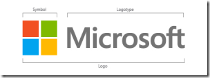
The logo has two components: the logotype and the symbol. For the logotype, we are using the Segoe font which is the same font we use in our products as well as our marketing communications. The symbol is important in a world of digital motion. The symbol’s squares of color are intended to express the company’s diverse portfolio of products.
From The Official Microsoft Blog.
Share this WHS Article with Others:


